A quick search will yield thousands of articles filled with best practices for boosting your conversion rates. At ROI Revolution, we believe in testing, testing, testing. We’re all selling different products, using different pitches, and relying on different platforms. What works for one site does not always work for another – so test it!
In this week’s Try This Test installment, we’ll take a look at an ecommerce-enabled furniture brand site that sells direct-to-consumer.
Situation
The client came to ROI Revolution with a desire to maximize overall conversion rates in the face of increased competition and advertising costs within their vertical.
Hypothesis

The physical dimensions of furniture can automatically lead one to assume that shipping costs will be high. Within the furniture market, shipping costs tend to either be free, or the cost is downplayed until the user is in the cart or checkout. If shipping costs are not clearly communicated, it could lead a user to assume they will be hit with shipping fees at a later step in their journey.
By emphasizing our client’s free shipping value proposition on the product display pages (where the majority of paid traffic was landing), shipping cost anxiety should be eliminated and conversion rates boosted.
Treatments
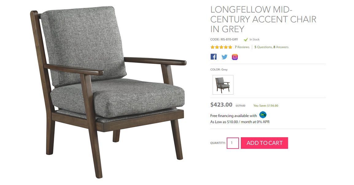
 Social sharing icons on the product page layout are generally disregarded by users. Almost universally, removing them has no effect on conversion rate or social share rates. (Most social sharing happens after the purchase.)
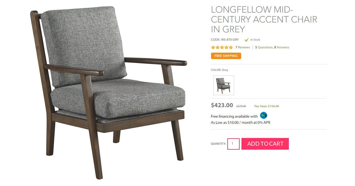
To make better use of this space, and to promote that shipping was free, we removed the social sharing icons and replaced them with a simple small banner in a contrasting color that read “FREE SHIPPING.”
Control

Variation 1

Results
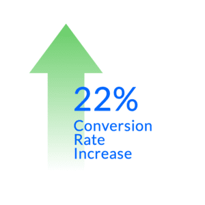
Variation 1, with the “FREE SHIPPING” messaging, had the best performance, with a 22% lift in conversion rate at a 93% confidence level.
Try It Yourself

Do you provide free shipping – especially for large products that tend to have higher shipping costs?
If you’re not properly promoting this information, you risk letting your users draw their own conclusions at earlier points in the buying cycle, which could lead to lower conversion rates. To reduce friction and ultimately increase conversion rates, try testing different wording and design treatments to draw attention to the fact that products ship for free.
Follow along with the next posts in this series below:


