A quick search will yield thousands of articles filled with best practices for boosting your conversion rates. In the current supply chain climate, stock status is a hotter topic than ever. At ROI Revolution, we believe in testing, testing, testing. We’re all selling different products, using different pitches, and relying on different platforms. What works for one site does not always work for another – so test it!
In this week’s Try This Test installment, we’ll take a look at a site that provides pest control products for the do-it-yourself market and their use of stock status to reduce friction and increase average order value.
Situation

We had a concern that the way in which product availability information was displayed did not make it immediately clear to the users if a product was in stock.
Hypothesis
By clarifying the stock status for products that are currently in stock, we will reduce friction caused by vague phrasing and increase add-to-carts and average order values (AOVs).
Treatments
The original wording appeared to be boilerplate shipping information, rather than information directly tied to a product’s true availability.
In both treatments, the green “In Stock” text was added the begging of the availability explanation, and the text size was boosted slightly for increased prominence and legibility. In Variation 2, a green check mark was added to further emphasize the “In Stock” messaging.
Results
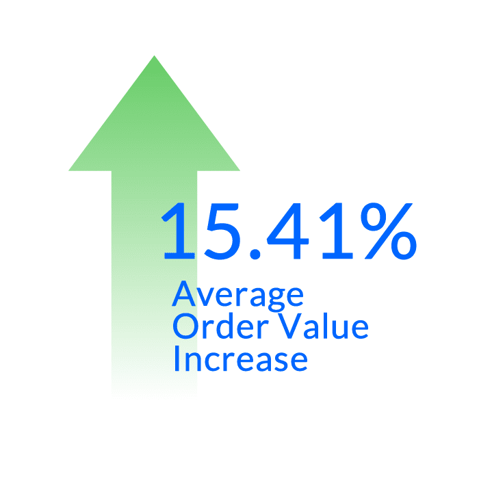
Variation 2, with the prominent “In Stock” text and check mark, had the best performance, with a 15.41% lift in average order value at a 98% confidence level.
Try It Yourself
Are you clearly communicating stock status to your customers? In the 21st century ecommerce landscape, customers expect to have a window into your inventory and shipping process during critical decision points.
If your stock status messaging is vague, try testing different wording and design treatments to draw attention to the fact that products are in stock and ready to ship.
Follow along with the other posts in this series below:


