A quick search will yield thousands of articles filled with best practices for boosting your conversion rates, but something that is often overlooked is clarifying the login vs. guest checkout options. Since no two sites are the same, at ROI Revolution, we believe in testing, testing, testing. We’re all selling different products, using different pitches, and relying on different platforms. What works for one site does not always work for another – so test it!
In this week’s Try This Test installment, we’ll take a look at a site in the agriculture space.
Situation
Analytics data, backed up by heatmaps, showed that confusion was happening at the first step of checkout.
Hypothesis
 At this stage in the evolution of ecommerce, users are conditioned to expect the option to checkout as a guest or log into their existing account. A third option to create an account during checkout is often offered at the beginning or end of the checkout process.
By clarifying the two standard options (login or guest), we will create a more linear checkout process that will help more users successfully convert.
Treatments
Conversion optimizers tend to obsess over removing as many steps as possible from forms and processes, with the idea of streamlining the user experience. However, in some cases, adding a step can help clarify the user journey and provide for a better experience.
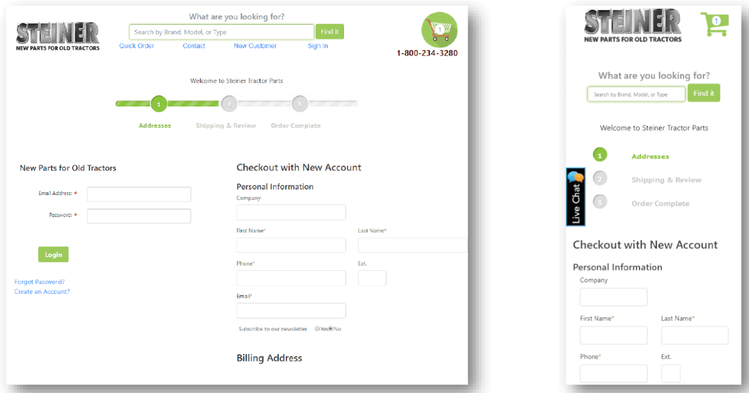
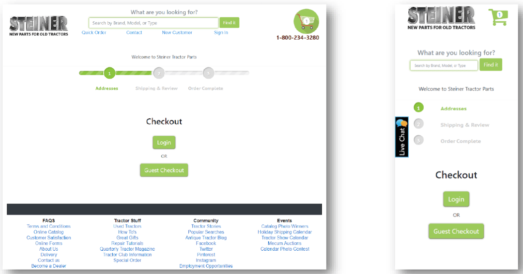
In this particular test, in the first step of the checkout process, we added a layout that had two buttons: one for “Login” and another for “Guest Checkout.” After this point, the corresponding form was shown to the user and the remainder of the checkout process was the same.
Control:

Variation 1:

Results
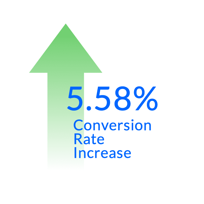
Variation 1, with the added clarifying checking out step, had the best performance, with a 5.58% lift in conversion rate at a 99% confidence level.
Try It Yourself
Is the first step of your checkout process crystal clear? If your user is required to scan the full contents of the layout in order to determine how to proceed, you risk checkout abandonment.
To reduce friction and ultimately increase conversion rates, try testing different wording and design treatments that clarify the guest/login options for checkout.
Follow along with the other posts in this series below:
- Try This Test: Emphasize Free Shipping on Product Detail Pages
- Try This Test: Featured Testimonial on Mobile Cart
- Try This Test: Clarify Stock Status on Product Detail Pages
- Try This Test: Add a Prominent “Email Cart” Feature for High-Consideration Purchases


