


You’re running Google Ads, the clicks are coming in, but conversions? Not so much. It’s a frustrating (and expensive) problem we see all the time, and the culprit is usually the landing page. A great ad can get someone to your site, but a great landing page is what seals the deal. At ROI Revolution, we know what works (and what tanks your ROI).
In this post, we’re breaking down the landing page best practices that move the needle, so you can stop losing leads and start getting results.
5 Core Principles of High-Converting Landing Pages
1. Above-the-Fold Messaging
The top of your landing page, the part users see without scrolling, needs to do a lot of heavy lifting. It should clearly communicate what you’re offering and why it matters. Make sure your headline and supporting content match the message of the ad that brought the user there. Including your main keyword in this section not only reassures the visitor they’re in the right place but it can also help boost your Google Ads Quality Score.
2. Mobile-First Design
If your landing page isn’t mobile-friendly, you’re leaving conversions on the table. Even if most of your sales happen on desktop, chances are many users first discover you on mobile, especially through Google Ads. That first impression needs to be fast, clean, and easy to interact with on any device.
A mobile-first design means more than just being “responsive.” Make sure your buttons are easy to tap, your copy is broken into bite-sized, scannable chunks, and your forms are simple to complete on a small screen. And skip the auto-playing popups or slide-ins; mobile users are quick to bounce when something feels clunky or disruptive.
3. One Goal per Landing Page
Each ad should send users to a landing page with one clear job: convert that specific user. Whether it’s getting someone to fill out a form, book a call, or make a purchase, keep the focus tight. Multiple CTAs or competing offers only create confusion and reduce conversions. Keep your call-to-action front and center, both visually and in the copy. Use strong, action-driven language like “Book Your Free Demo” or “Shop the Collection Now.” The more obvious and compelling the next step is, the more likely users are to take it.
4. Build Trust with Social Proof
Imagine you’re scrolling through your favorite social media app and see an ad with tons of positive comments underneath. One person raves, “I love this product so much!” and then you spot your neighbor’s cousin chiming in, “OMG. Seriously the most comfortable thing I’ve ever worn.” Just like that, you trust the brand a little more—and you’re more likely to click.
That same principle applies to your landing page. When people see familiar, genuine testimonials or reviews, they feel reassured. Whether you’re asking them to buy something or fill out a form, social proof helps lower hesitation. Include things like star ratings, short customer quotes, or even recognizable client logos to build credibility fast. Want to go the extra mile? Add trust badges from sites like BBB.org or Trustpilot.com. Whether it’s paid traffic or organic, trust signals make it easier for your visitors to say “yes.”
5. Modern Design
If your landing page still looks like it was built in 2005, it’s probably time for a refresh. Modern design isn’t just about aesthetics; it’s about guiding users to take action quickly and confidently.
Start by placing key content strategically. Moving pricing details to the top of the page, increasing the font size, and changing the color yielded a 5.7% conversion rate lift for eCommerce client, Peter Millar.
Interaction Design Foundation recommends placing details on the page in a Z pattern from the top left to bottom right so it follows the way our eyes naturally take in content.
Make your call-to-action buttons bold and impossible to miss. Use clean layouts with plenty of white space, scannable bullet points, and short paragraphs that are easy to digest. Every element on the page should have a purpose.
Apple.com’s modern homepage
Visuals matter too, but they should support your message, not just decorate the page. For eCommerce, include all product variations (like color, size, or flavor) right on the landing page so users can easily make a decision without extra clicks. Don’t make them hunt for what they need.

Screenshot of cleansimpleeats.com with flavor options on the page
Finally, anticipate common questions with helpful, relevant content. That could include care instructions, shipping details, return policies, or an FAQ section. The easier you make it for users to find the info they need and complete their goal, the higher your conversion rate will be.
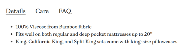
Screenshot from a product page on cozyearth.com showing details, care instructions, and FAQs
6. Speed = Conversion
Nobody likes a slow site, especially mobile users. In fact, even a one-second delay can tank your conversion rate. Tools like Google PageSpeed Insights or GTmetrix can help you gauge performance and identify quick wins. Optimize your images, reduce unnecessary scripts, and ensure your landing pages load quickly across all devices. Fast pages don’t just convert better, they also score higher with Google, which can lower your ad costs.
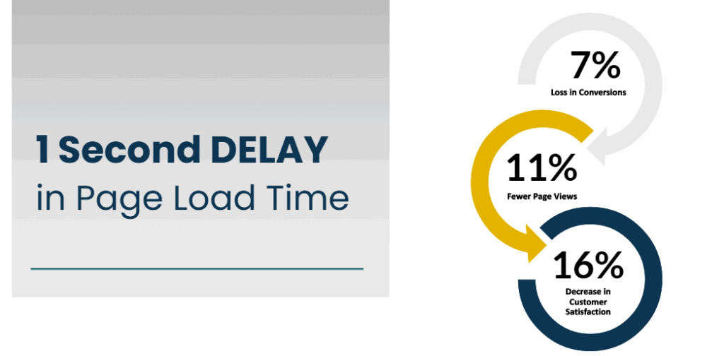
Screenshot showing the effects of a one second delay in page load time
Need proof? Luxury watch reseller Crown & Caliber saw a 31% lift in organic conversion rates and a 53% increase in organic revenue just by shaving one second off their page load times.
If all this sounds a bit technical, don’t worry; our SEO team can help you diagnose and fix speed issues so your landing pages start pulling their weight (and then some).
Landing Page Best Practices Checklist
Here’s a quick checklist as you begin to optimize your Google Ads landing pages. Each landing page on your site should:
- Have a clear headline that matches your ad
- Load quickly
- Be mobile-friendly
- Focus on one clear CTA
- Have a clean, modern design and layout
- Include relevant product info
- Display trust signals like reviews and badges
Don’t Let a Bad Landing Page Waste Good Clicks
You’ve paid for the click—now it’s up to your landing page to close the deal. Whether it’s matching your ad’s message, loading lightning-fast on mobile, or clearly guiding users to a single action, every detail plays a part in converting traffic into results. By focusing on trust signals, strong visual design, streamlined content, and user-friendly functionality, you can create a landing page that doesn’t just look good, it performs well, too.
If you’re not sure where your landing page stands (or know it needs help), our team is here to dive in and optimize it for real-world results. Let’s turn your ad spend into serious ROI. Book a meeting with our Paid Media team today.
Sources
Interaction Design Foundation, https://www.interaction-design.org/literature/article/visual-hierarchy-organizing-content-to-follow-natural-eye-movement-patterns#z_pattern-2