


A quick search will yield thousands of articles filled with best practices for boosting your conversion rates and among those is often emphasizing key product discovery features. At ROI Revolution, we believe in testing, testing, testing. This is important considering no company is the exact same. We’re all selling different products, using different pitches, and relying on different platforms.
In this Try This Test installment, we’ll take a look at a site that sells a wide variety of sleep therapy equipment in an effort to improve their overall conversion rates by emphasizing key product discovery features.
The Situation
By offering a large amount of different equipment for sleep therapy like CPAP machines, masks, humidifiers, filters, cushions, and mask parts, this website almost certainly carries what any customer is looking for. However, such a large selection can actually make finding a specific product more difficult.
The brand’s team at ROI was concerned that users were not able to find their desired products and were leaving the site to search elsewhere. The site already had a comprehensive secondary navigation on desktop and mobile that allowed users to narrow down their search, but data showed that only 11% of users were actually interacting with this tool.
Hypothesis
Increasing the prominence of the left-hand navigation will lead to increased usage, and thus, higher conversion rates.
Treatments
The site already had a solid secondary navigation tool, but its white color caused the tool to blend in with the rest of the site. On top of that, it was collapsed by default on both desktop and mobile devices.
The UX and conversion rate optimization experts at ROI changed the color of the secondary navigation to a blue hue within the client’s branded color scheme in order to make it stand out from the rest of the page. Additionally, the team expanded the navigation on desktop by default so that it is always present.
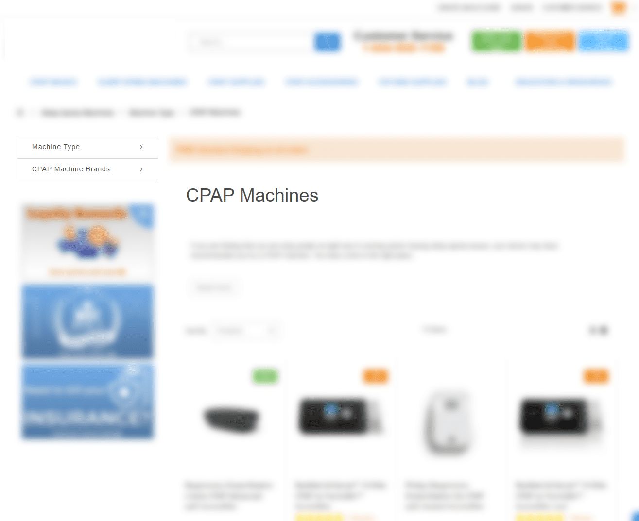 Control (Test A): The original website left pane layout
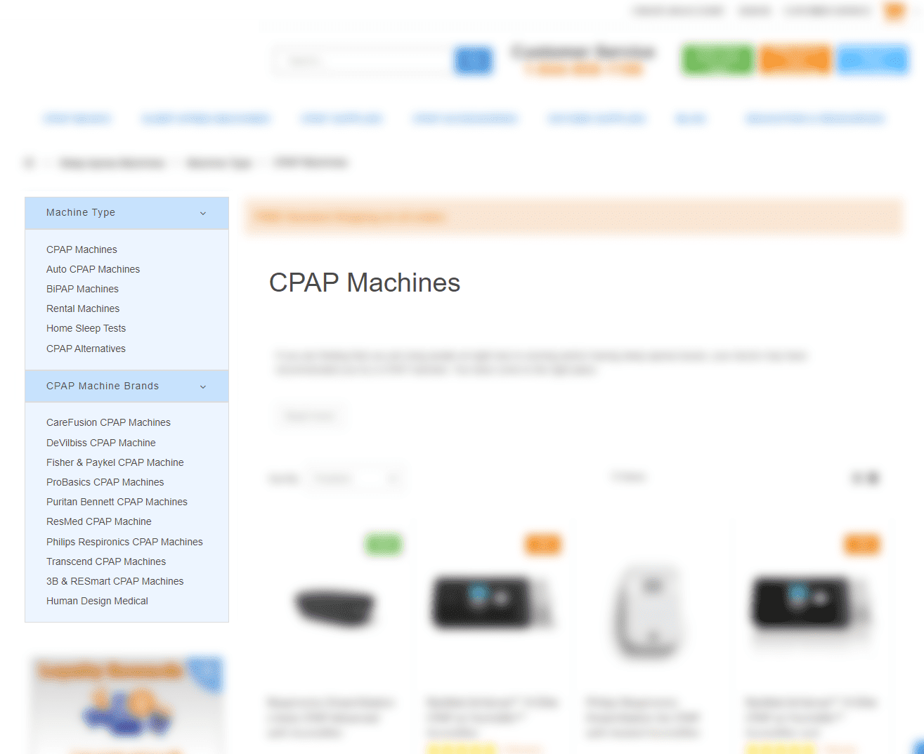
Variation (Test B): The version of the left pane testing the ROI team’s hypothesis to increase conversions
Results
The variation saw a 19.79% increase in transactions, 38.59% increase in revenue per session, and 20.35% increase in left-hand navigation use when compared to the control at over 95% confidence. In this instance, emphasizing key product discovery features had a huge impact on this brand’s bottom line.
Try It Yourself
Are you clearly presenting your users with the tools they need to navigate the wealth of products on your site? Simply providing your service or tool may not be enough. Drawing attention – even through a simple color change – can drastically improve the user experience and boost transactions.
If you feel like your customers are struggling to find what they’re looking for, try drawing their focus to solutions that are already present on your site.
Optimizing your website’s UX often reveals untapped revenue. To explore opportunities to grow your brand profitably with conversion rate optimization, reach out to our team of experts today.
Explore more of our Try This Test Series:
- Try This Test: Adding Subcategories on Product Listing Pages
- Try This Test: Add a Prominent “Email Cart” Feature for High-Consideration Purchases
- Try This Test: Clarify Stock Status on Product Detail Pages
- Try This Test: Clarify Login/Guest Checkout Options
- Try This Test: Featured Testimonial on Mobile Cart
- Try This Test: Emphasize Free Shipping on Product Detail Pages